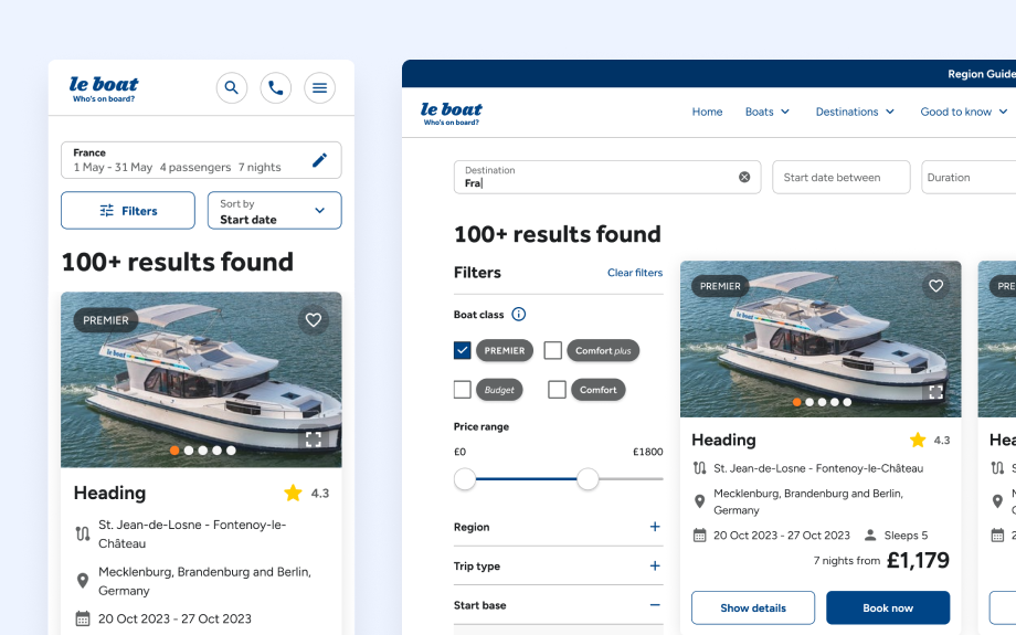
Impactful UI designs that elevate usability and conversion
Introduction
While working across multiple brands at Travelopia, I’ve delivered impactful UI designs that elevate usability through smart, incremental changes. Whether through A/B testing or usability scoring, these designs have proven their worth, even overcoming technical challenges to be tested and refined with real user feedback.
Search results redesign
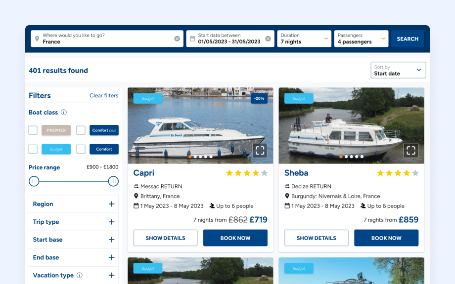
Impact: A system usability test post-redesign showed a 47% usability uplift on desktop and 22% on mobile.
Goals: Simplify the search results page by reducing duplicate boat options and ensuring users are guided smoothly toward product pages, retaining their search criteria.
Summary: I reimagined the search experience by addressing the flow from quick search to search filters and final results. After mapping user feedback, reviewing competitor analysis, and conducting a heuristic analysis, I built interactive prototypes that were tested on UserTesting.com, achieving significant usability improvements across devices.
Mega nav revamp
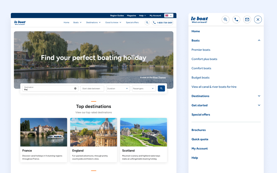
Impact: Increased search interactions by +0.2%, a +25% rise in “Contact Us” form usage, +2% in “Request a Quote” form submissions, and a +17% uptick in calls.
Goals: Restructure the site’s navigation to streamline access to content and improve user experience.
Summary: Reviewing navigation clicks from quantitative data, I proposed a new menu structure aligning with top user tasks and business needs. I created prototypes tested with users, receiving positive feedback for the simplified menu. Some user suggestions like a side menu were considered, though ultimately deprioritised to avoid cognitive overload.
Mobile results card redesign
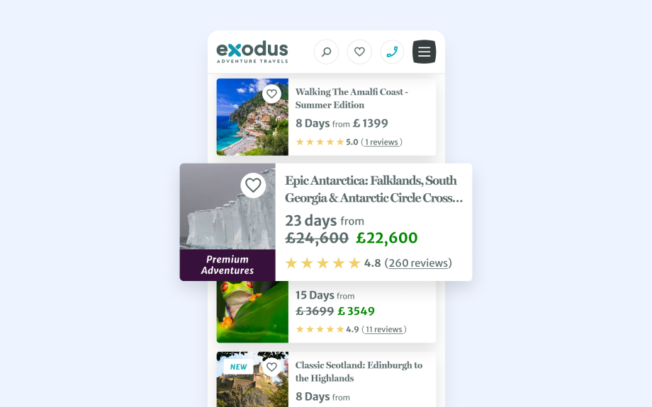
Impact: +9.3% increase in trip page views, +40.2% in contact form submissions, and a 7.1% boost in users starting the booking process.
Goals: Improve mobile usability by reducing the size of trip cards to encourage more scrolling, making it easier for users to explore relevant trips.
Summary: Using mobile-first design principles, I created compact trip cards with key information, inspired by a previous wishlist component. These design tweaks significantly increased engagement with trip details and led to improved conversions.
Trip page redesign
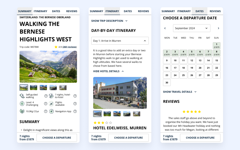
Impact: Achieved a 34% usability uplift on mobile, as measured in a system usability scoring test with UserTesting.com.
Goals: Enhance the trip page layout based on user feedback and insights from sales teams and stakeholders.
Summary: I began by grouping and categorising feedback and observations alongside each section and components of the whole trip page. I built out these components in figma and created an initial concept for review with teams and stakeholders, looking at feasibility. Because of limited traffic to the website for testing and because it is a complex test to build I created a prototype for testing with participants. I used figma to build an interactive prototype, utilising properties and variables to streamline the work involved in its creation.