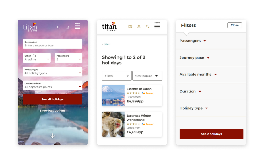
Collaborating with an agency to enhance the search system
Overview
- Led a comprehensive redesign of the search system to enhance user experience and align with industry-leading design patterns.
- Conducted in-depth user research and testing, identifying key pain points and opportunities for improvement.
- Collaborated with internal teams and external agencies to implement solutions.
- Successfully addressed user struggles with the search bar’s functionality, resulting in a more intuitive and responsive system.
- Created and iterated upon prototypes, ensuring accessibility and responsiveness across devices.
- Finalised the search engine flow in collaboration with agency partners and in-house developers, delivering a faster and more efficient search experience.
Challenge
The current search system was found to be unfit for purpose.
I see search as the main tool for discovery on the website and was found to be the ‘top task’ carried out by visitors.
An excellent online search system is fundamental in meeting the expectations of the user. As users, we have gained familiarity in the use websites such as Google and Amazon and expect an immediate and predicted experience.
Contributions
I took a human-centred design approach into researching and realising objectives that could improve the current search system. I collaborated with various team members and an agency to realise the solutions.
Systems used: Google Analytics, Figma, SessionCam, Miro, User research, User testing
User research
A colleague and I carried out user testing with 5 candidates who were incentivised by cash for helping and candidates approved of us recording these sessions. We observed them carry out tasks on a computer that we provided for our face-to-face meeting.
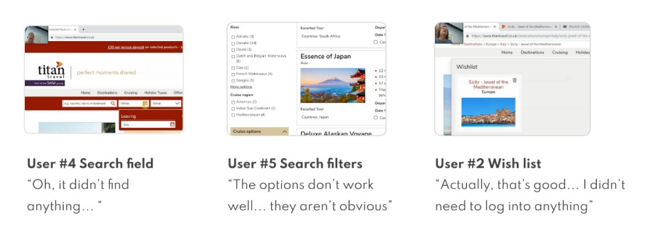
The search system should allow visitors to use keywords, filter and sort to provide results for a perfect trip. Users struggled with the search bar. They found the search bar’s behaviour confusing (search suggestions, calendar and filters), slow and unexpected. The search bar is the primary interaction on the website and has been shown to hinder user journey overall.
One highlight, User #3 was impressed that our wish list feature worked. She found it useful to store tours and access them “to show friends”. These persist on personal computers but if she were to use her friend’s computer – it would not show. She was excited at the idea of having an account login in order to store these wish lists. In order for these wish lists to persist across devices, they would need to be stored in an account. Having a site-wide account would allow for this.
Competitor analysis
Search bar
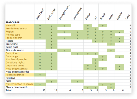
As expected, common search bar options included Region, Holiday Type and Product Search. Many sites used the date picker and date range functionality but the difference was that not all sites enforced it. Auto-suggest was fairly common and I expected that some sites would make use of ‘product cards’ but surprisingly this as well as ‘recent searches’ and ‘review score’ were not used at all. This could mean that there is an opportunity to test the effectiveness of these.
Top 5 competitors in escorted touring:
- Rivieratravel.co.uk – 100% affinity
- Travelsphere.co.uk – 94% affinity
- Travel.saga.co.uk – 87% affinity
- Newmarketholidays.co.uk - 80% affinity
- Leger.co.uk – 79% affinity
Visitors build up familiarity with systems over time (Jakob’s Law) and may expect similar solutions / models and behaviour elsewhere. Therefore, it made sense for me to check leading websites like Google Flights, Airbnb and Skyscanner. It also gives a picture of emerging trends and tech being used.
Our customer’s personas decribe their other interests - such as Waitrose, Marks and Spencer and the Daily Mail. These brand’s websites were also audited.
Overall, there is a lot of variation between large brands and direct competitors in the way of showing reviews in search results and listing individual tour listings. Titan Travel currently lists the tour name but defines the departure dates in the checkout whereas Expedia forces you to choose the date from the outset – removing the ‘cost of interaction’.
Interestingly, websites such as rivieratravel.co.uk and tui.co.uk recall your search query from your last session – making for a great UX.
Cottages.com had a ‘view on map’ option with manageable clustered properties as well as a filter.
Search results
The search results page is obviously closely tied to the search bar. Competitors have shown various result card layouts and the use of different filters and sorting.
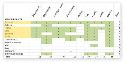
With an initial assessment of the information architecture and structure, the Titan results cards appear cluttered.
Currently, the search result ‘cards’ with tour information take up a lot of space and do not utilise it very well. I thought this space could be utilised better, eliminating any wasted white space and having a larger CTA. I also suggest that we have a sticky header to display filter and sort options to the user. The dropdowns can be less imposing style-wise, such as the date selection/calendar and look more streamlined so as to display well on all devices.
A card sorting excercise was sent to a group of customers in order to understand their preferences for the search results filter order. This helped to inform the ordering of the search results filter to improve ease of use.
Approach
Initial ideas for the search bar
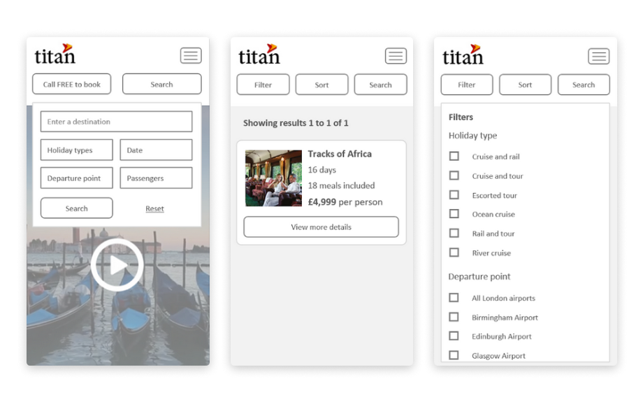
User testing and competitor analysis inspired initial ideas. I suggested that the search bar is displayed prominently over the hero image as it a. saves above the fold space and b. is more prominent on the page for the visitor. This functionality would not work very well on mobile devices so, instead of being in the hero, users can click on a ‘search’ button to open the search dropdown.
Initial ideas for search results
I suggested that we have a sticky header to display filter and sort options to the user. Filters drop to the bottom of the page on mobile devices and they are only given the ‘edit search’ option at the top of the page. The dropdowns can be less imposing style-wise, such as the date selection/calendar and look more streamlined so as to display well on all devices.
Going forward
I created a working prototype of a site redesign that incorporated ideas for search. This was part of a “big vision” prototype concept that helped as a reference but also to get stakeholders and teams on board and excited.
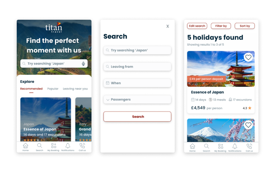
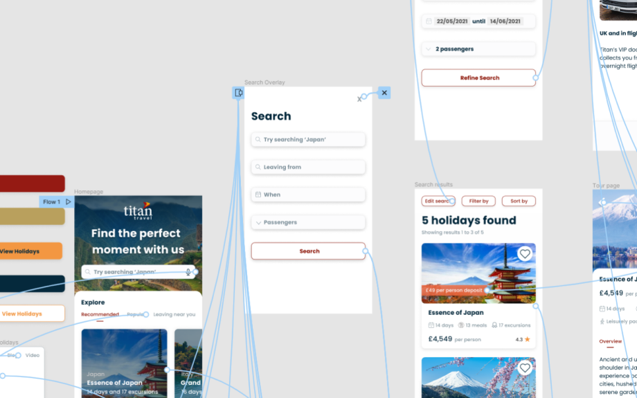
With an agency, we began a discovery phase with the work and insights I had already gained to explore concepts further.
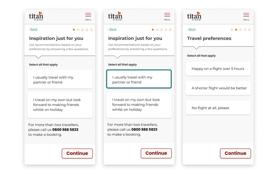
An idea was conceived in collaboration with the project team and UX Designer from an agency. It would help ‘inspire’ visitors that are unsure about a new destination and allow them to take part in a ‘search wizard’ or guided search so that they could define their trip better. This was put aside as a future project but during user testing, we found this to be a popular concept.
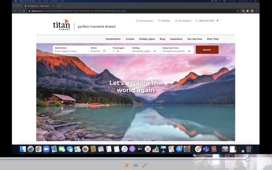
An agency UX Designer, UI Designer and I collaborated on iterations and user testing to finalise the search engine flow that, once completed, was handed off to our in-house JavaScript Developers. During this time accessibility enhancements and bug fixes were made to the search bar to provide a faster more responsive system.