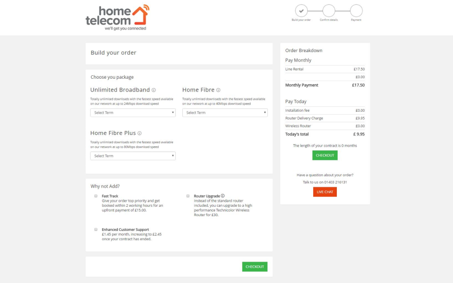
67% increase in broadband sales with ecommerce rebuild
Overview
- Enhanced sign-up conversion and visitor retention for a UK broadband reseller.
- Led the project alongside a PHP Developer, focusing on wireframing, data analysis, and checkout development.
- Reduced checkout steps by 50%, resulting in a 67% increase in broadband sign-ups and record-breaking sales.
- Identified key challenges including mobile user drop-offs and confusion at various checkout stages.
- Revamped checkout layout for simplicity, addressed issues with button clarity and site responsiveness.
- Explored potential for further personalisation, estate agent branding integration, and basket implementation for returning visitors.
Challenge
Improving sign-up conversion rate and visitor retention were the goals of this project. This was achieved by simplifying and enhancing the online checkout experience for visitors of a UK based broadband and fibre reseller.
The B2C telecoms business provides broadband connection services to customers around the UK. They tailor a range of packages for calls, broadband and Sky TV which include no long-term commitments.
Contributions
The team that worked on this project comprised myself and a PHP Developer. I produced wireframes in Photoshop for each step of the checkout journey as well as the components for the pages. I also analysed data in Google Analytics and used Crazyegg and Hotjar to assess heatmaps and session recordings.
The checkout was programmed in-house by our PHP Developer and was built to connect to Stripe. Transactional emails were controlled with Mandrill and Mailchimp.
Systems used: Google Analytics, Data analysis, Crazyegg, Hotjar, Photoshop
Some of the achievements include:
- Reducing the checkout flow from 8 to 4 steps
- 67% increase to broadband package sign ups
- A record number of online sales in week one
Visitor overview
Visitors to the checkout come from an email which is sent from their estate agent. The email informs them about the products and they link to the checkout which tends to be co-branded with the estate agent. Alternatively, the visitors arrive directly or organically to the website. Visitors are able to select broadband package deals online as they continue through the checkout process.
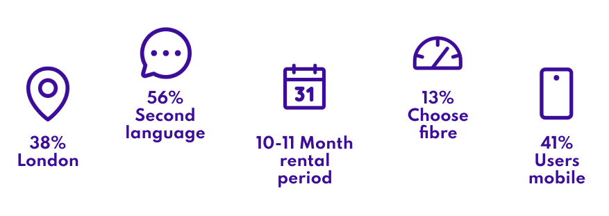
An export of our current database showed that the typical user will live in and around London and is less likely to have English as a first language. It was essential to use clear copy on the page and to carefully consider mobile responsiveness.
Data from Google Analytics over the last three months showed that the first interaction with the sign-up flow is using a mobile device. Analytics revealed that 98% of visitors don’t make it to the ‘Summary page’.
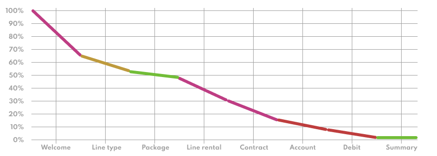
The three highest areas where drop off occur are the ‘Welcome’, ‘Line rental’ and ‘Contract’ pages.
Even though there is a fairly clean and simple layout, the 33% Drop off (39% for mobile) is likely to occur on the ‘Welcome’ page due to lack of trust and visitors not knowing the true value when engaging with the flow and the form.
Now that users are deeper in the flow, a 39% drop off on ‘Line rental’ and data shown in heat and click maps indicates that there is confusion around the promotion code, and on top of this – it is the first page where price becomes clear.
A mix of confusion together with the rather long process up until now has left a lot of users with a lack of motivation to continue further.
With the highest drop off here being 48%, it suggests that visitors are simply impacted by the costs on the ‘Contract’ page and as there is not much information to motivate them, more visitors will drop from the flow at this stage.
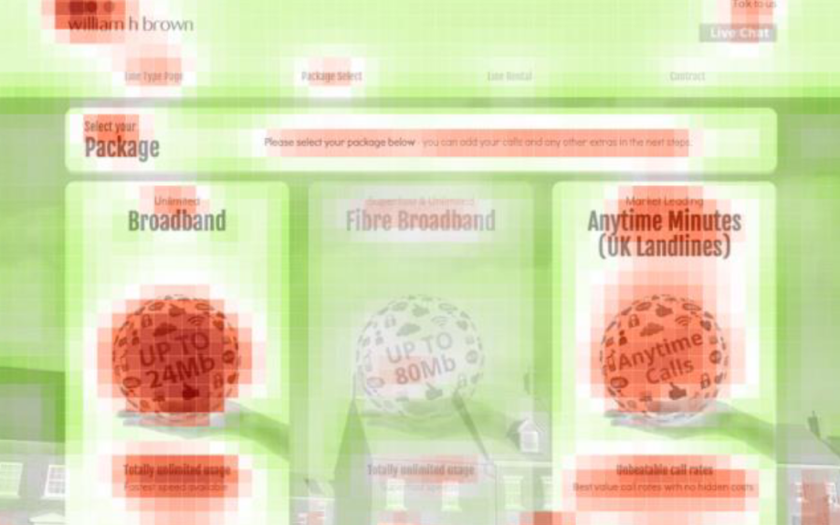
There appeared to be a lot of general confusion.
Many visitors hover over the ‘talk to us’ portion of the header but no one actually engages with the live chat button below it.
On initial pages the “Let’s go” button does not have a forward going arrow, and the wording could confuse some users, as it is more directly related to exiting.
The “Back” button is not clickable – which will make users very confused as it is clearly a button, and they expect to be able to go back by clicking on it.
The website is not fully responsive – content misalinement and excess overspill of the view port occurs to create a poor experience. Load times are poor and elements on the page seem as if they have frozen.
Going forward
A rebuild of the system allowed for a much cleaner, simpler approach to the layout. A greater reduction in the steps required by the user and more clarifaction in the content can reduce confusion, stress and cognative load.

When changes went live, user behaviour continued to be assessed in session recordings from Hotjar. Ideally, a more iterative approach to changes should have continued.
The checkout might be enhanced further with the branding of the estate agents by incorporating their colour scheme into components, for example.
Furthermore, if additional data was available about the status of their move we could target those that are motivated by the area they are moving to by dynamically changing the background to reveal a Google map.
Personalisation could take place for those looking to sign up, such as couples who had just moved in or family renters. If data was available, the background image could reflect these visitors and even an alternative value proposition could be shown to engage further.
This would only need to occur at the beginning alongside the value proposition because subsequent pages have components that fill the screen.
Finally, an assumption is that it would be effective to implement a basket to the checkout. This would allow return visitors to be targeted and provide the capability to continue from where they left off. This could also suite those that return to the main site to find out more.