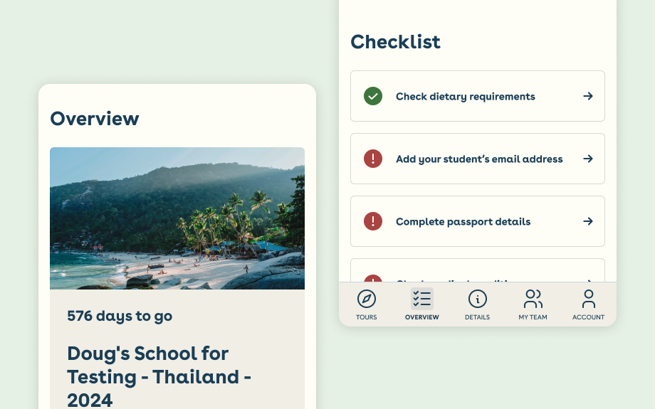
Revamping a customer portal for easier navigation and usability
Reports kept coming in from World Challenge’s support teams about issues with their customer portal.
World Challenge provides life-changing, experiential travel opportunities for 15-18 year olds. The portal needed to be intuitive for users like students, parents, and expedition leaders, allowing them to manage bookings and update pre-departure information.
As the designer at Travelopia for World Challenge, I reported directly to product managers, owning the design process from research to prototyping.
View the prototypeThe project details…
I aimed to improve the portal’s information architecture and simplify its navigation by reviewing the existing flow, mapping the current features into a more user-friendly experience and aligning it with user journeys. The scope was limited to improving the existing features, with no plans for introducing new ones.
- Time frame: 8 weeks (18 Oct - 24 Nov 2022)
- Role: UX Designer.
- Responsibilities: A complete workflow of customer journeys, refined information architecture, wireframes, and a high-fidelity UI that aligned with World Challenge’s brand guidelines.
- Impact: Addressing 40+ user painpoints and friction.
Let’s all get on the same page during discovery
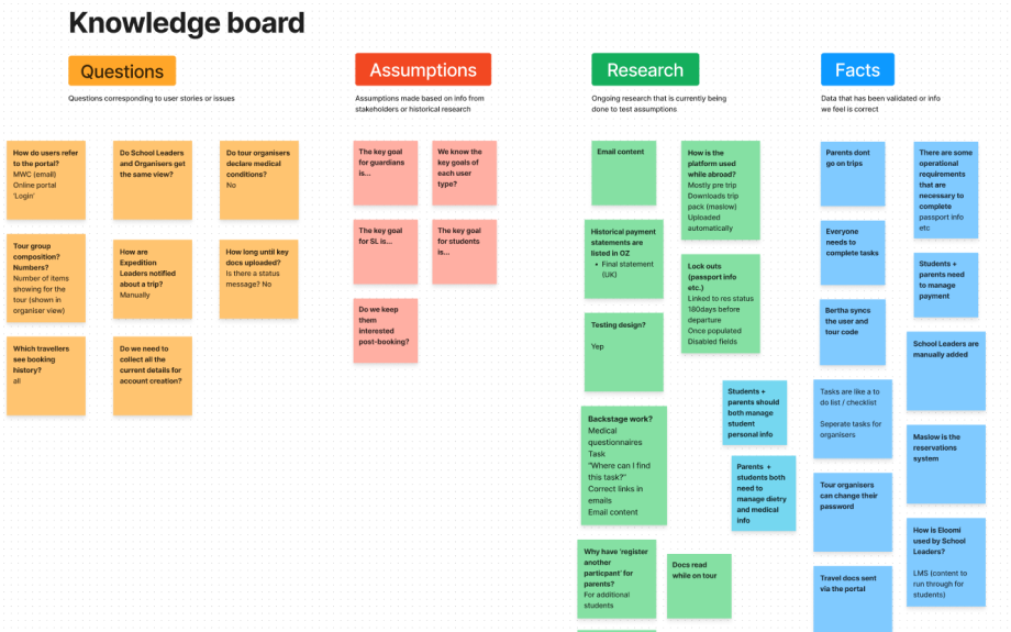
To kick off the project, I created a ‘knowledge board’ - a process I find helpful for gathering and organising information during the discovery phase. This board included:
- Questions: Issues we needed to explore further, often tied to user stories.
- Assumptions: Preconceived ideas from stakeholders or based on historical research.
- Ongoing Research: Testing assumptions and hypotheses.
- Facts: Validated data or information deemed reliable.
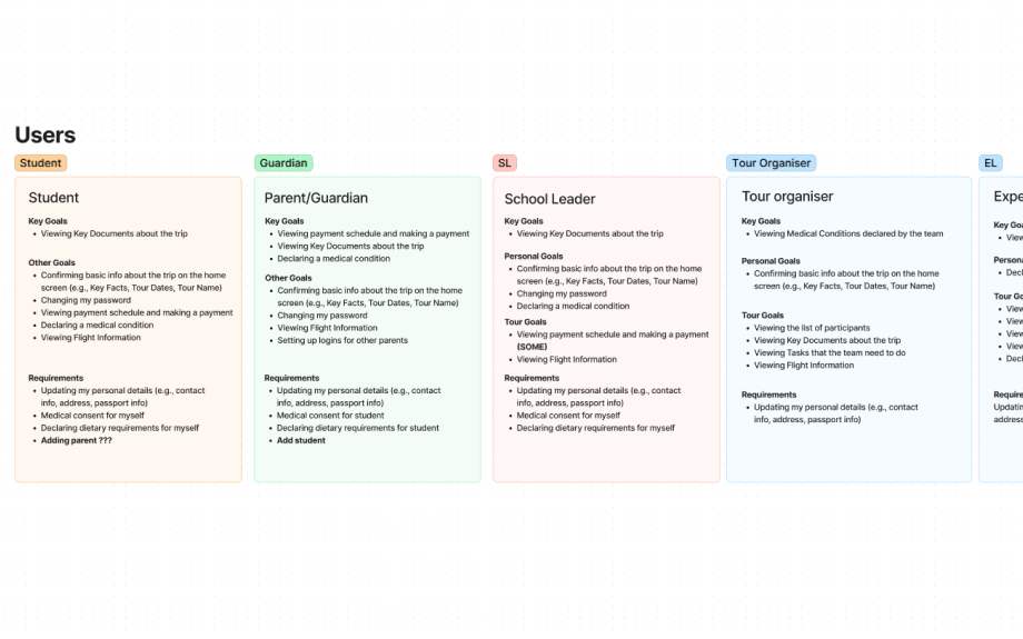
The portal served different user types - students who wanted to view trip documents, parents who managed payments and medical declarations, and school leaders or expedition organisers who needed to access students’ medical information. While each user group had its specific tasks, there were overlaps in journeys, particularly around personal information.
So, I created simple personas to obviously help me and others in the team align and empathise with the users.
I proposed sending a user survey to gather feedback directly from users. While a full survey wasn’t possible due to time constraints, I outlined key questions that would have explored the users’ pain points, priorities, and overall experience with the portal.
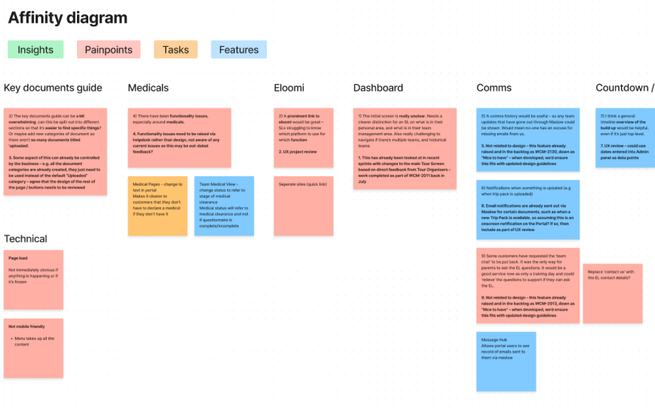
Although we couldn’t launch the survey, I collaborated with the sales and customer support teams to gather insights on frequent user pain points. I then created an affinity diagram to map the key areas of the portal, such as ‘documents guide’, ‘medical info’, and ‘login’. I categorised these into ‘insights’, ‘pain points’, ‘tasks’, and ‘features’ to focus our design efforts.
Exploration
I took a hands-on approach to understanding the user journey by conducting a usability audit. Using dummy accounts as both a parent and a student, I went through the flows for a placeholder trip. This gave me a clear view of the information architecture and navigation issues.
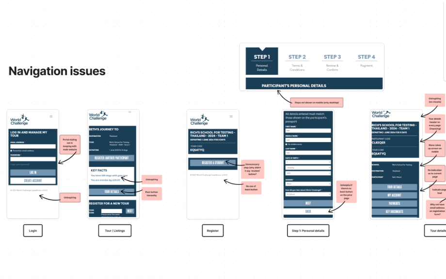
Some of the primary navigation issues included difficulty finding key pages, unnecessary duplicate links, and general clutter. I mapped out the portal’s sitemap, identified duplicate navigation items, and noted other usability issues like inconsistent back buttons, copy repetition, and overall clunkiness. These insights formed the foundation for the redesign.
Design
With branding assets on hand, I ensured the colour schemes and typography remained consistent with World Challenge’s guidelines. I decided the portal needed to feel independent from the main website to avoid confusion. I captured all key components in a Figma style guide as I progressed.
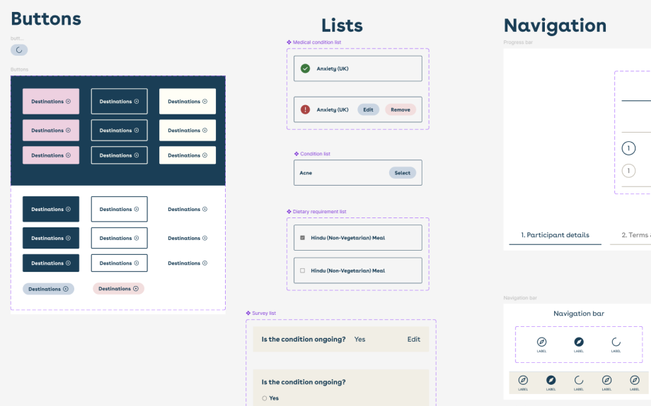
For the layout, I opted for a dashboard format with a simple, intuitive navigation structure for both desktop and mobile devices. On mobile, I introduced a navigation bar for easy switching between views, while the desktop version used an expanded navigation rail for a more streamlined experience. This approach significantly improved the organisation of menu items without disrupting user flows.
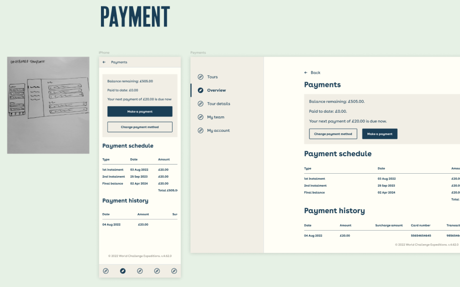
One of the biggest improvements was cleaning up the mobile design, which previously felt cluttered due to long, listed menu sections. By focusing on mobile-first best practices, I made navigation more intuitive, giving users a much smoother experience.
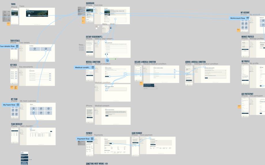
An interactive prototype was produced and presented to key stakeholders. The feedback was positive, with the team expressing enthusiasm for the improvements.
Final thoughts
I was proud of the outcomes of this project. The revamped portal significantly improved navigation and usability, and it was well-received by both the stakeholders and the rest of the business. Although I wasn’t involved in the final QA process as it moved to the development team, I was confident the changes would enhance the user experience and help users reach their goals with ease.