25% Uplift in brochure sign-ups through A/B testing
Overview
- Implemented A/B testing strategy resulting in a 25% uplift in brochure orders.
- Collaborated with a small marketing team to design and validate an alternative form layout, enhancing user experience.
- Utilised data analysis tools such as Google Analytics and Hotjar to inform design decisions and improve conversion rates.
- Prioritised ideas based on business demand, impact, ease, traffic, and supporting research, ensuring continuous improvement.
- Led the redesign of the brochure request page, maintaining brand consistency and enhancing usability through user testing.
Challenge
Design and validate a new layout for a brochure request web page for an escorted group touring company. An online form to view or order up to three complimentary brochures for delivery.
Contributions
As the sole designer on this project, I worked within a small marketing team to code and test an alternate form layout and alternative success message.
Systems used: Google Analytics, Data analysis, Hotjar, Adobe Target, VS Code, User testing
Approach
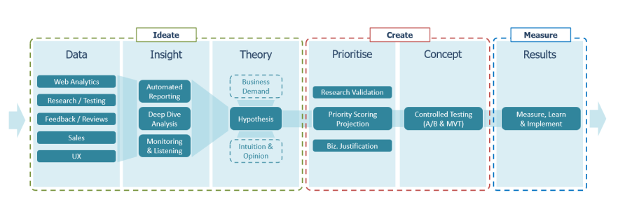
My process is to discover, define, build, measure, repeat. Existing data, customer feedback and their behaviour help to inform how I can optimise online conversion and experiences. Ideas are prioritised through a scoring system based on business demand, impact, ease, traffic and supporting research. Improvements to the digital channels are continuously insight-driven, even after creation or implementation.
Context
Existing usage data, as well as customer feedback, were available for analysis. Hotjar was used to view session recording. The main aims were to improve ease of use and increase order conversion rate through the validation of ideas.
Observation
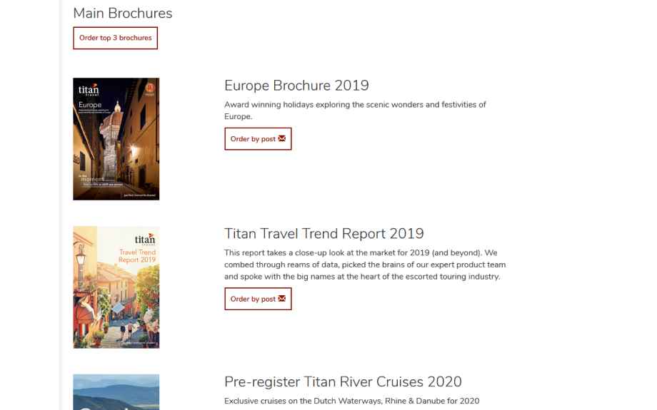
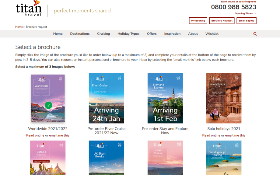
Based on observations, I theorised that by changing the layout from a list to a grid, using checkbox selections on images and including the form fields on the same page rather than an extra step, we’d increase request rates.

Initial ideas
Layout changes of the brochure request page to improve ease of use. The positioning of brochures as a grid makes more brochures visible on desktop devices and raises up the form closer to the page fold.
Testing
With a confidence of 99% and an uplift of 25% in brochure orders, variant B won after 4 weeks. A case was raised with web developers and changes were soon implemented.
Going forward
Later changes to the existing form included disabling the submit button until a brochure had been selected. It was realised that there can still be confusion due to the lack of effective form validation text and due to the brochure selection resetting.
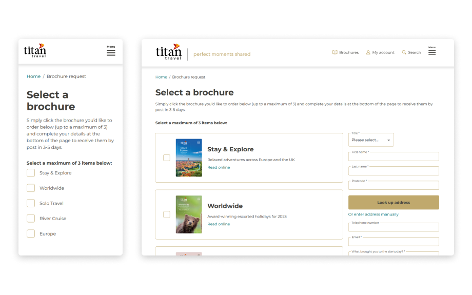
As part of a website rebuild, I designed the brochure request page again. I knew there were still some improvements to be made. I used the stylisation provided by a UI designer that I closely worked with so that the design was in keeping with the rest of the website and brand guidelines.
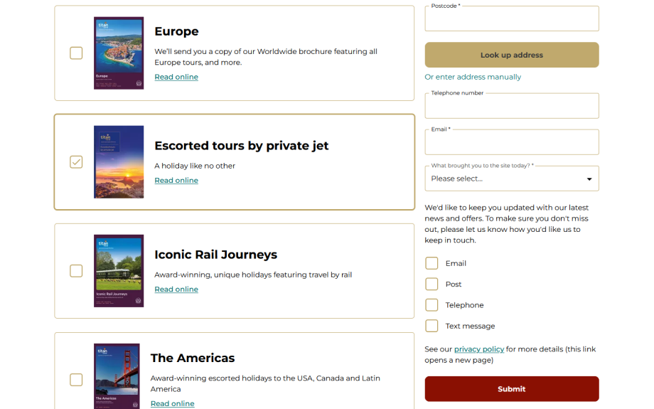
The use of checkboxes was maintained but placed as components alongside a form in a sidebar. Elevating the form fields further would reduce scroll depth and clarify to the visitor the actions they are expected to complete.
User testing
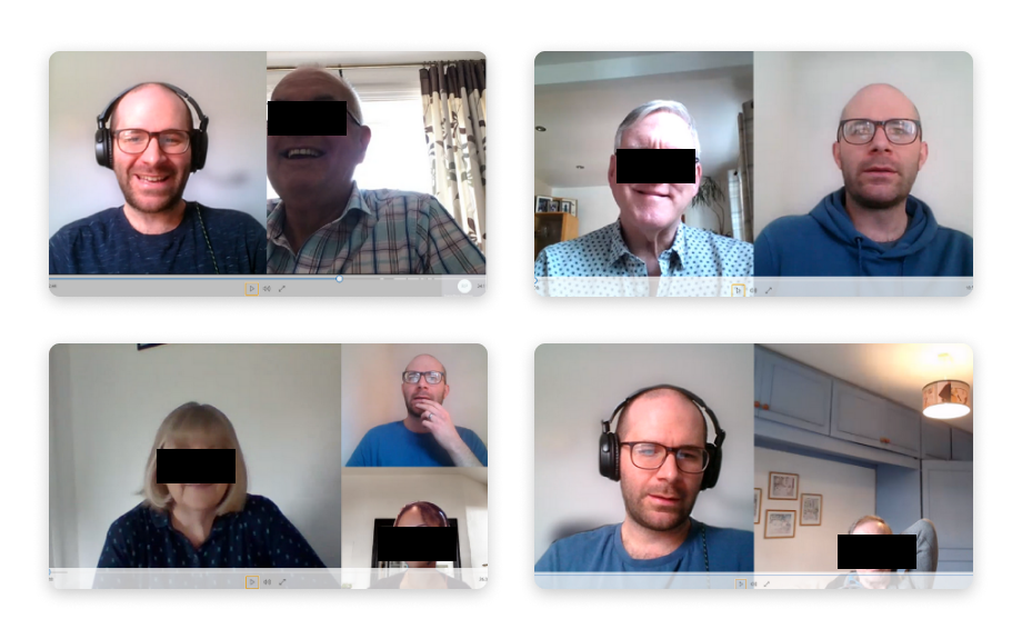
Through user testing, it was confirmed that the changes made were convenient, enjoyable and significant. As a whole, those that were interviewed commented that the look and functionality is less confusing than before.
