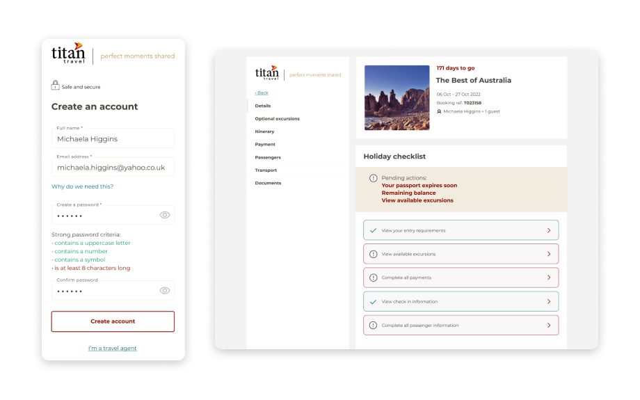
How research helped overhaul a booking management system
Overview
- Developed a holiday booking reservation system aimed at enhancing customer experience and meeting business objectives.
- Prioritised seamless self-service functionality for customers, aiming to reduce service issues and minimise customer calls.
- Led user research efforts, including direct feedback analysis, statistics review, and interactive prototype development for remote usability testing.
- Conducted competitor analysis, examining apps to identify patterns and inform design decisions.
- Collaborated with project managers and agency partners to efficiently plan sprints, retrospectives, and task prioritisation, driving the project forward.
Challenge
The holiday booking reservation system for travellers looking to manage their trip. Completely overhaul the post-booking reservation system so that it enhances the customer experience, future-proofs and meets business goals.
Some of the main objectives included:
- A paperless solution: move the majority of customer docs from paper and post to an email solution. The system needs to also host all customer documents.
- Getting the basics right/being current: allowing customers to self serve seamlessly and intuitively
- Reduce service issues: Making the system faultless so it doesn’t generate calls
Summary
When a holiday has been booked, the booking reservation system provides online access to functionality for customers and trade agents to view, amend and service bookings. Users can update their personal information, make payments, review their holidays and check the documentation.
Opportunities to improve the existing system and user experience were identified from insights and facts derived from user research. In addition to this, sales teams often reported technical issues that they or the customer had been experiencing.
A new user account system was designed and developed as part of a wider website rebuild project.
Contributions
The team consisted of project managers from within the business as well as in the agencies we collaborated with. As the driving force behind the project, managers efficiently planned the sprints, retros, and prioritisation of tasks that I took part in.
My initial responsibilities involved analysis of visitors’ use of the current system through direct feedback, statistics, web sessions and call recordings. Later, I went on to speak to past and present customers (and visitors who opted in to help) while developing interactive prototypes in Figma so that more unbiased and useful facts would be gained in remote usability testing. The prototypes incorporated already established UI styling.
Systems used: Google Analytics, Data Analysis, Figma Prototyping, User testing, Empathy mapping
User research
The accumulation of feedback from customers and the sales team as well as routine user sessions were gathered and helped to structure and prioritise further areas of research. In conjunction with this, session recording with Hotjar provided further evidence and insight into quick wins as well as the underlying issues that needed to be designed.
Competitor analysis
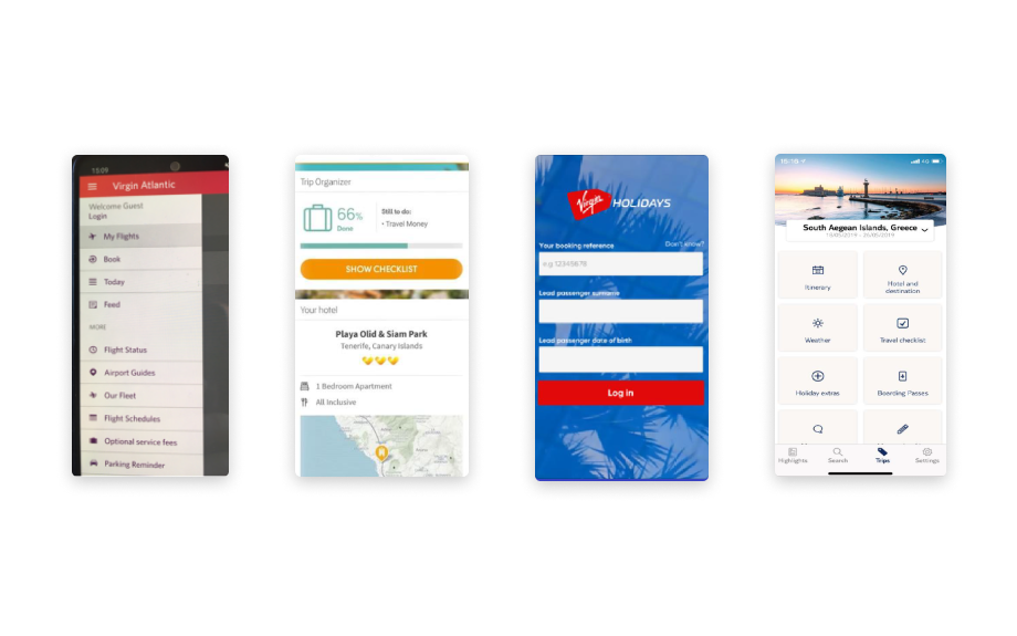
A number of competitor apps were examined, including Virgin, TUI, and Thomas Cook. This gives a picture of emerging trends and tech being used.
Virgin Holidays app
Virgin’s login page, although looks simple and branded as much as possible, is an inconvenience to the user. Because it makes use of the booking reference a user would have to refer to and search their emails in order to find the reference. It wasn’t until a later login session that it provided a pop up to remember these details and take the user through straight away when opening the app again.
TUI app
The immediate insight is that the apps don’t use the superfluous information that we find in MyTitan such as on the ‘Home’ screen. It’s immediately obvious what is available when a holiday is selected and through the user experience, the journey is unmistakable. Tiles are a common theme seen on these apps and are beneficial to older people due to the large button tap area.
Thomas Cook checklist
Like Tui, Thomas Cook also makes use of a checklist feature. It gives the reassurance that nothing has been forgotten or removes the misconception that the company will be responsible for something (such as third party flight check-in).
Approach
Addressing existing issues
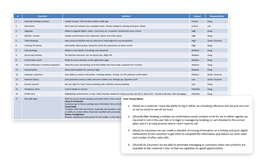
From my audit and because we saw repeat issues from customer feedback and session recordings, an array of customer roadblocks was easily prioritised.
The fundamental issue was that when a visitor makes a booking, we take their details at the point of sale but are notified by email that they can sign up to the booking management separately. This causes issues, especially if the booking was made through a sales call because there may be errors in the personal information they provided. This leads them to sign up with different details and so the two sets of information do not sync in order to show their booking.
Not only is this concerning and stressful for the customer, the additional sign up step extends the whole process.
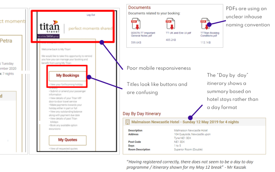
Other problem areas existed in titles looking like buttons, the poor responsive layout of the account on mobile, poor control of their personal details or upgrades to flights, rooms, excursions etc. from their account.
Documentation was an issue. PDFs used a bad in-house naming convention. The layout could be clearer to show items chronologically and there is an opportunity to allow for the documents to be read online as well as downloaded. Must have all customer documents available online as HTML and with the ability to download.
As part of a website rebuild, the booking management system was eventually redesigned and developed into an account so that it can eventually be used site-wide.
With an agency, we began a discovery phase with the work and insights I had already gained to explore concepts further.
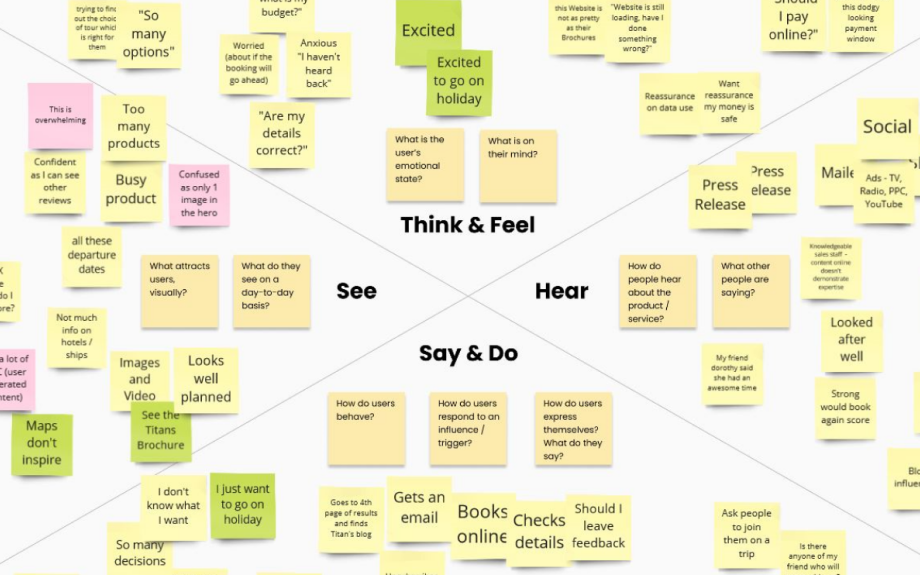
The team took part in workshops during a discovery phase of the rebuild project, such as ‘I like, I wish, I wonder’, ‘stakeholder mapping’ (priority matrix), ‘Crazy 8s’ and empathy mapping using ‘thinking, seeing, hearing, doing’.
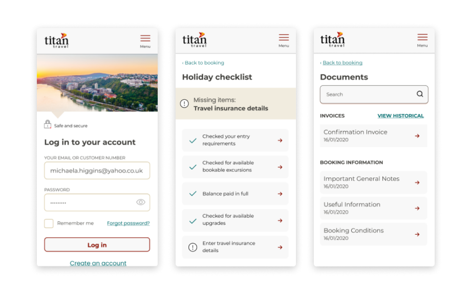
I worked with an agency UX designer for the initial ideas of the booking management account.
There were struggles with initial ideas and it became evident that a user-friendly navigation was essential to the account when following designs from a mobile layout into a desktop layout. As a solo designer during this step, I tried various solutions to meet an outcome that was expected to be most logical for users.
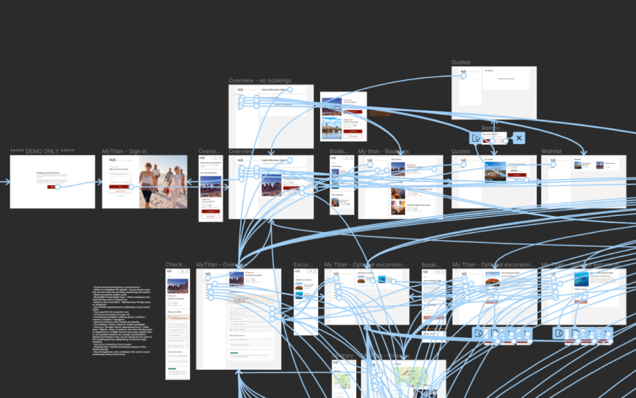
I created a prototype in Figma of a working system with the use of stylised components and branding that were produced by a UI Designer from the agency. This allowed me to run user testing and iterate on designs, this was especially helpful for the documents section of the account because it identified some confusion from the participants.
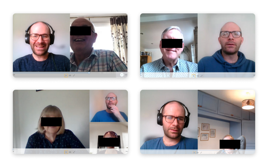
I organised and ran user testing and interview sessions remotely. Those that I invited and interviewed consisted of new and existing customers, most of whom aligned to preexisting user profiles.
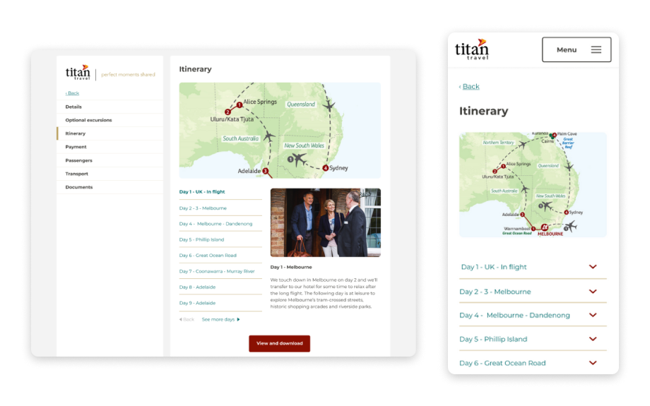
Part of using a human-centred design process is to present wireframes or prototypes and receive feedback or insights which help to inform later iterations. Because trade agents were also able to use the system to manage their customer trips, it was important to interview and find out more about how this user group would access and navigate an account based on their motivations.
Going forward
Moving forward, the management of reviews presents an intriguing opportunity facilitated through a site-wide login. Users often visit forums in search of advice and additional information. Establishing a dedicated forum for Q&A and feedback could empower customers to find solutions independently, thereby reducing resource demands at Titan. By actively monitoring the forum, we can gain valuable insights into customer issues and concerns, ultimately enhancing our products and services.
While these initiatives may be considered as part of our broader business strategies, they are also shaped by comments and perspectives shared by our customers, providing inspiration for these ideas.