A Univesal Design System
Recently, a few things have come together that inspired me to push for a Universal Design System within my design team. One of the key moments was watching a talk by Brad Frost, where he discussed the future of design systems and how organisations currently maintain them.
In his talk, Brad’s main point was that many organisations around the world are managing design systems (usually in Figma) that aim to streamline workflows using reusable components like buttons, accordions, and other UI elements. However, he made an important observation: we’re all building the same components — over and over again! Each company is creating nearly identical patterns and elements (and often using various libraries), even though they could be shared.
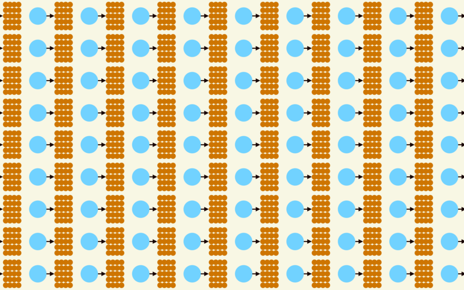
(source: bradfrost.com)
Brad suggested the idea of a global design system, one that could prevent duplicated efforts and allow teams to focus on more meaningful work, like improving accessibility and overall quality. That idea really hit home for me.
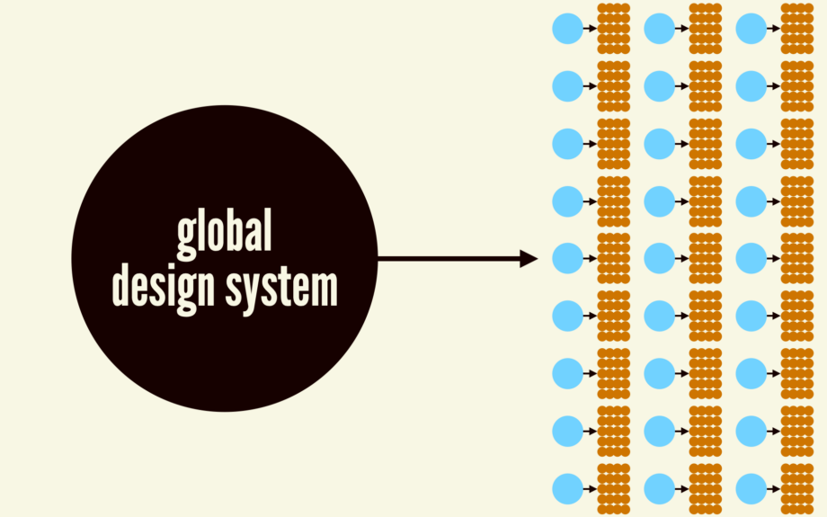
(source: bradfrost.com)
Our Current Situation: Fragmented and Inefficient
It made me think about our own team, and honestly, we’re even more fragmented. My organisation manages multiple travel brands, and each brand has its own separate design system in Figma. Every designer on the team has created or is maintaining a completely independent system for their assigned brand. Do you see where this is going?
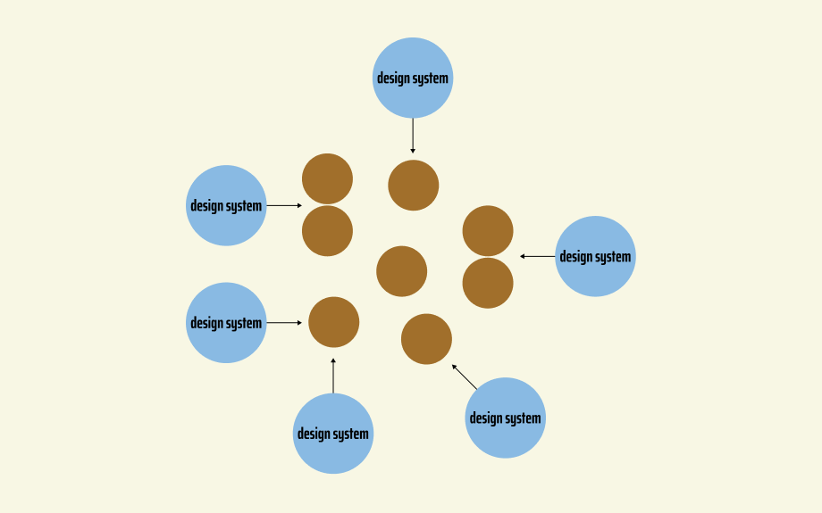
I started to wonder, why not have one design system for all the brands? So, that’s exactly what I proposed to the team and began setting up.
The benefits of a Universal Design System
I outlined some of the key benefits of maintaining one centralised system for all our brands:
- Encourages collaboration across teams
- Reduces errors by having consistent design patterns
- Boosts productivity by reusing components instead of reinventing them
- As we acquire new brands, they can quickly adopt the system
- Ensures consistency in design principles, accessibility, and user experience
- Saves time and resources when scaling or adding new elements
- Simplifies management of components and files, reducing duplication
- Easier to manage Figma updates and features
- With many of our brands transitioning to WordPress, reusing components across brands makes the shift much smoother
Challenges to consider
Of course, there are always challenges, especially with Figma’s current limitations:
- Text styling (uppercase, weights, etc.) can vary between brands
- Effect styling (drop shadows, etc.) may not carry over smoothly
- Global updates to components could be tricky
- How to handle CRO and component-specific updates for different brands
- May not be ideal for external teams who require more flexibility
Still, the recent updates to Figma, particularly variable modes, gave us a great opportunity to move towards a universal system. Variable modes, usually used for dark and light themes, also allow for variations based on branding. This made the idea of a centralised component library more feasible than ever.
Moving forward: testing the concept
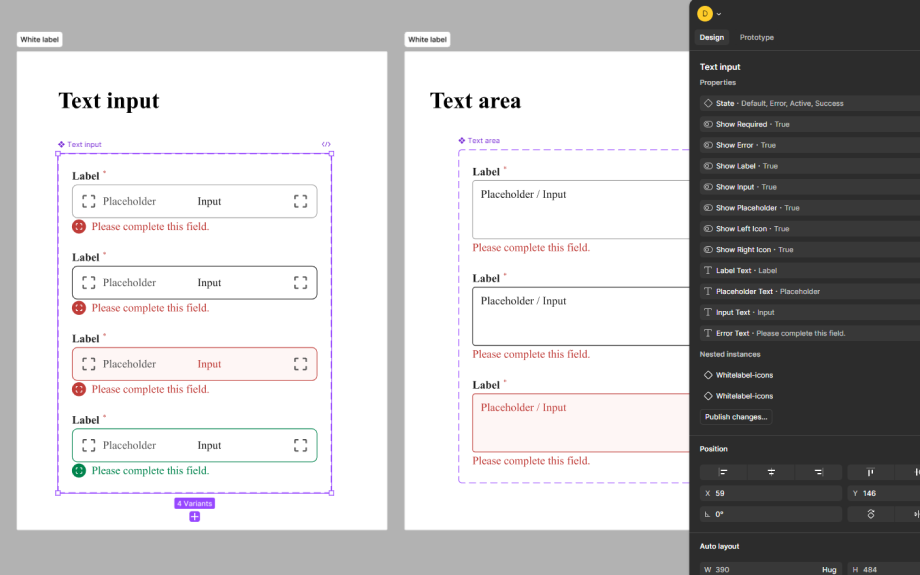
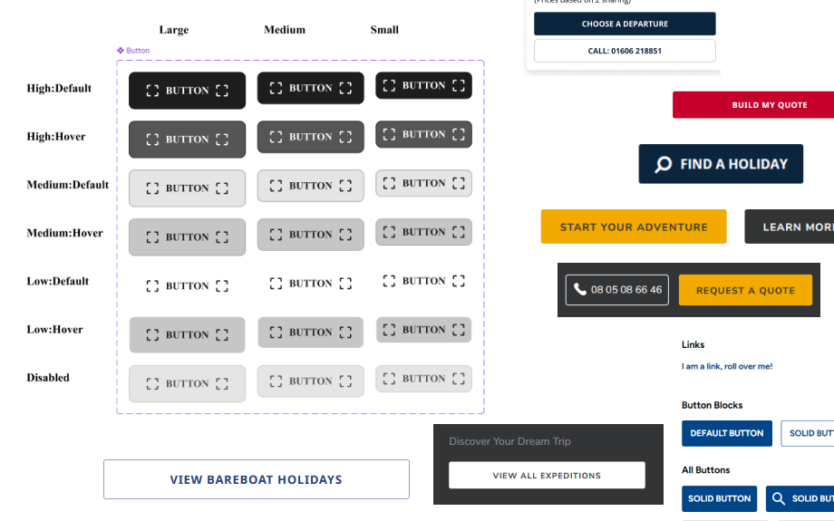
To test out the idea, I started small by building universal buttons. I created their properties and variations and tested how mode layers would work for different brands. Here’s the process I followed:
- Collected references for each brand’s core components, like buttons, labels, and toggles.
- Built the structure for each component type, adding variables for customisation along the way.
- Merged duplicate components where possible to reduce redundancy.
- Sectioned off each component, making them easy to share and use.
- Invited the team to add their brand-specific styles to the variable modes.
I intentionally kept the base components simple and neutral, so they could be eaily identified and allw us to focus on structure. Once the components were built, it was just a matter of creating an instance and switching the ‘variable mode’ appearance to match the desired brand.
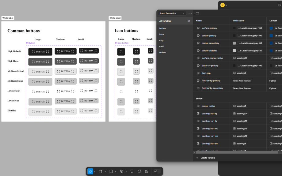
After publishing the file, the team could access and use the components across projects.
Tips for managing a Universal Design System
One important thing I learned: managing the scope of these variables is important - keeping them well-organised makes it a lot easier to maintain the file over time.
Another tip is to treat icons as components themselves. That way, when a component is reused, the properties of the icon can be easily switched to match any brand’s identity.
Final thoughts
Transitioning to a Universal Design System has been a game-changer for our team. It’s still a work in progress, but by centralising our components, we’re already seeing benefits in terms of consistency, collaboration, and efficiency.
P.S. Like Brad, I think a Global Design System is the way forward too :D and it seems that Open UI is beginning that work.